
I love airports. Not just the travel, the buzz, or the duty-free Toblerone – but the architecture. In another life, I think I’d have been an architect. In this life, I just loiter around terminals, taking way too many photos of he ceilings and skylights of the airport architecture.
Because when you think about it, airports are some of the most fascinating public spaces on the planet. They’re supposed to be functional, but when done right, they’re also full-on expressions of national pride, design ambition, and, occasionally, delusion.
Some terminals feel like futuristic art galleries. Others feel like they were designed by someone who hates people.
So here it is: my unapologetically biased, emotionally charged roundup of airport architecture – the beautiful, the bizarre, and the beige.
In This Post
The Icons
These terminals don’t just move passengers – they move you.
Hamad International Airport (DOH) – Doha, Qatar
Walking into Doha feels like stepping into a sci-fi opera. It’s all gleaming floors, towering arches, and the kind of lighting that makes you feel like you’ve got your life together. The art is bold (yes, that giant yellow teddy bear is the icon), the layout is smooth, and even the toilets look like they’ve been designed by Apple.

WingTips Verdict: “It’s giving museum of the future – minus the school kids and ‘do not touch’ signs.”
Hong Kong International Airport (HKG) – Chek Lap Kok
Designed by Lord Norman Foster (fancy), HKG is a masterclass in efficiency and elegance. The vaulted ceilings, clean lines, and glass-heavy design let the views take centre stage – and that mountain backdrop? Unreal.
WingTips Verdict: “Proof that you can be functional and fabulous – like a Swiss watch with dim sum.”
Bangkok Suvarnabhumi (BKK) – Thailand’s Glassy Giant
With its coiled steel columns and glass panels, BKK feels like a spaceship powered by Pad Thai. It’s big, bold, and unmistakably Thai, especially after spotting the gold statues and lotus motifs.
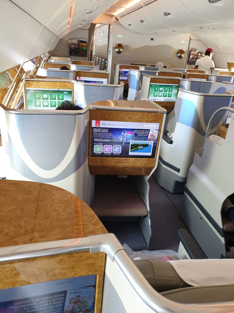
WingTips Verdict: “If IKEA built a temple with 30 million passengers a year.”
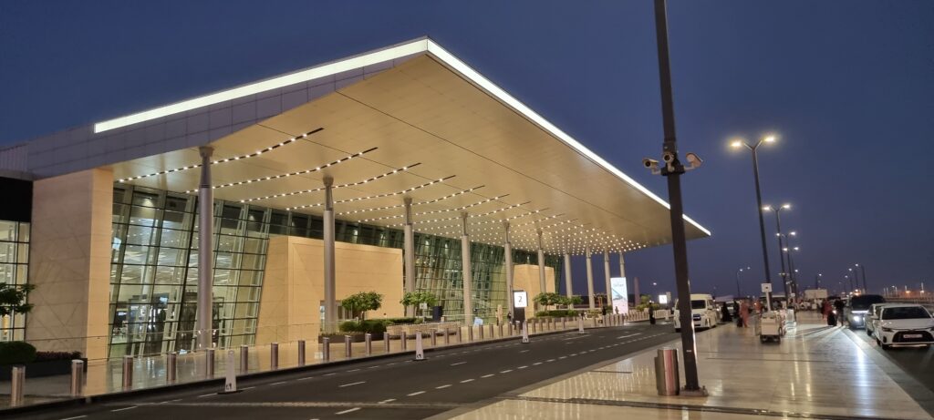
Delhi Indira Gandhi Terminal 3 (DEL) – India’s Golden Gateway
T3 is India’s design flex – with cultural motifs, mood lighting, and the famous giant mudra hand sculptures greeting you as you enter. It’s vast but thoughtfully zoned, and the blend of modern infrastructure with Indian aesthetics actually works. click here to read about the lounge at DEL airport.

WingTips Verdict: “Feels like a yogi got an architecture degree and a blank cheque.”
Helsinki-Vantaa (HEL) – Nordic Chic, No Fuss
Wood, light, and a sense of calm that borders on therapeutic – HEL is the introvert of international airports. The new terminal expansion adds even more breathing space and beauty, all wrapped in that minimalist Finnish vibe.
WingTips Verdict: “Like being inside a Muji store that makes planes.”
The Try-Hards
Almost iconic – but something’s just a bit off.
Abu Dhabi International (AUH) – The Terminal That Took Forever
AUH’s new Terminal A is the definition of architectural ambition. It’s massive and curvy and wants to be seen. But despite all the gloss, it has a weird sterility, like it was designed to impress investors more than travellers. Click here to read my review on the Etihad business class lounge in abu-Dhabi.
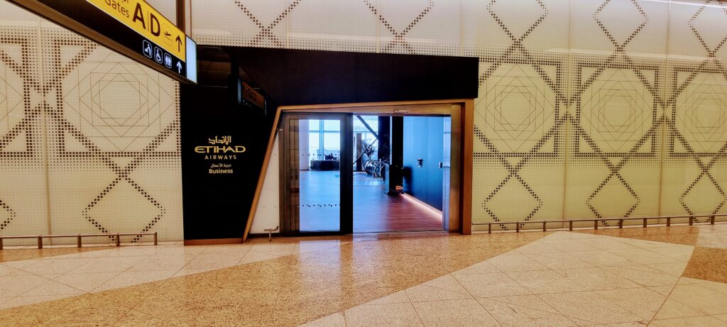
WingTips Verdict: “Looks rich, feels like a showroom. I’m still looking for its soul.”
Mumbai Chhatrapati Shivaji (BOM) – Ceilings, darling!
BOM’s Terminal 2 is genuinely impressive – the lotus-inspired design, the golden columns, and the huge art wall showcasing Indian culture. It feels like it wants to win awards. But scratch beneath the surface, and it can get chaotic. Click here to read my full review of the Oasis Lounge at BOM airport.
WingTips Verdict: “Gorgeous ceiling. Shame about the crowds and questionable signage.”
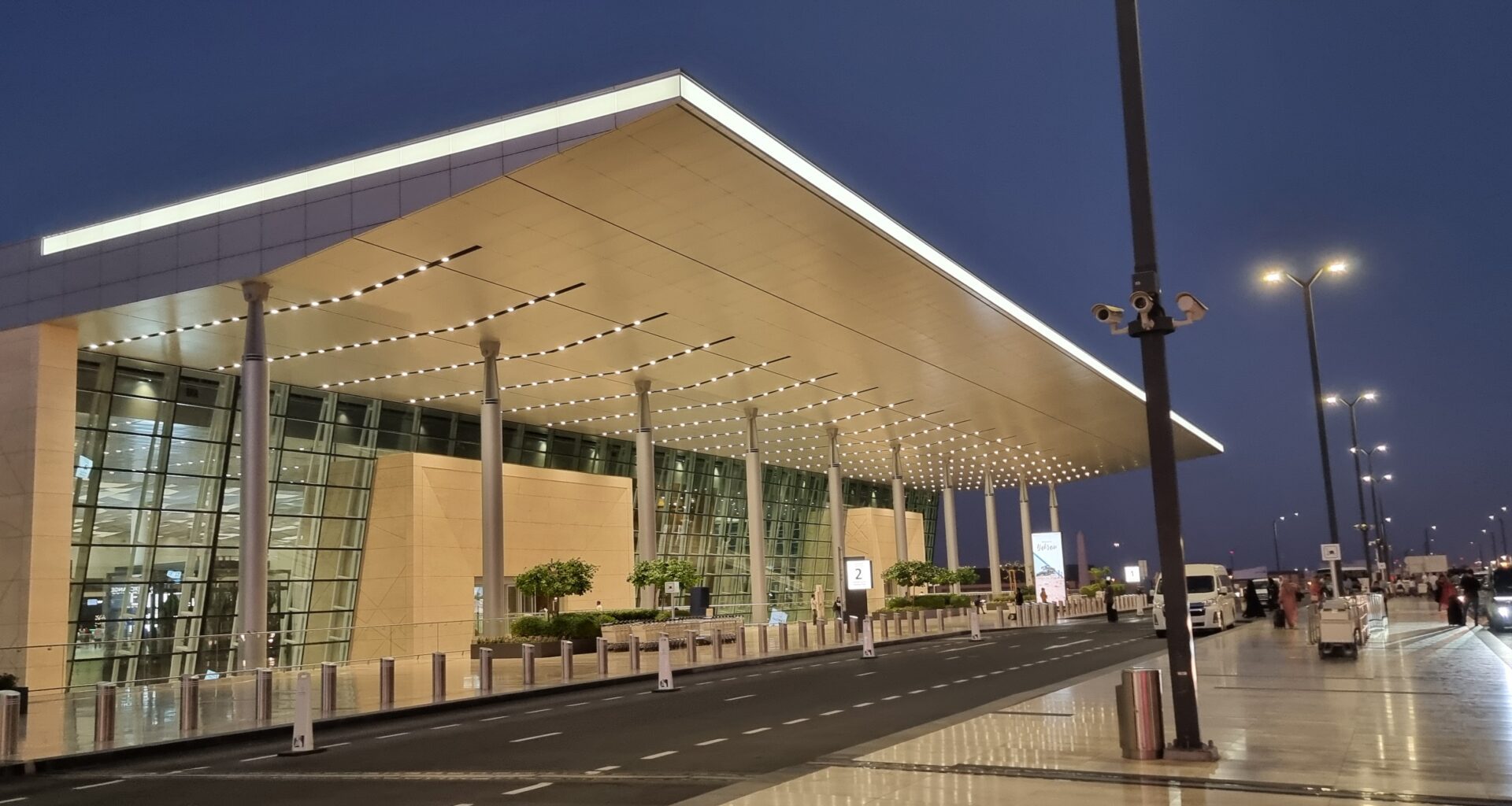
Bahrain International (BAH) – Still Finding Its Vibe
The new terminal is a step up from the old one. It’s clean, modern, and trying to join the Gulf’s big-league aesthetic. But it lacks the wow factor of its neighbours. Click here to read my article of the Pearl lounge at BAH airport.
WingTips Verdict: “Nice. Functional. No idea what it’s trying to say, though.”
New York JFK (Various Terminals) – The Eternal Renovation Site
The old TWA terminal? Iconic. Mid-century magic. The rest of JFK? A tragic patchwork of outdated terminals, confusing transfers, and ceiling tiles that have seen things.
WingTips Verdict: “America’s front door needs a serious makeover. And maybe a therapist.”
The Architectural Offenders
Ugly. Confusing. Soul-draining.
Los Angeles International (LAX) – Legally Unattractive
The terminals are a mismatched mess of low ceilings, dim lighting, and postmodern sadness. The retro space-age Theme Building? Fun! The rest? Crimes against travellers.
WingTips Verdict: “Come for the stars, stay for the baggage claim trauma.”
Miami International (MIA) – Tropical Chaos, Sans Charm
For an airport in one of the most colourful cities on Earth, MIA feels… grey. Maze-like corridors, dated signage, and zero natural light make it feel like a bunker for sweaty tourists. Virgin Atlantic B789 review here.
WingTips Verdict: “Architecturally inspired by a migraine.”
London Heathrow (LHR) – Pick a Terminal, Pick a Mood
T5? Sleek. T2? Passable. T3? Pure chaos energy. Heathrow is a personality disorder in airport form. T3, in particular, feels like it was designed during a rainy lunch break in 1974.
WingTips Verdict: “The UK’s busiest airport should not feel like a school science block.”
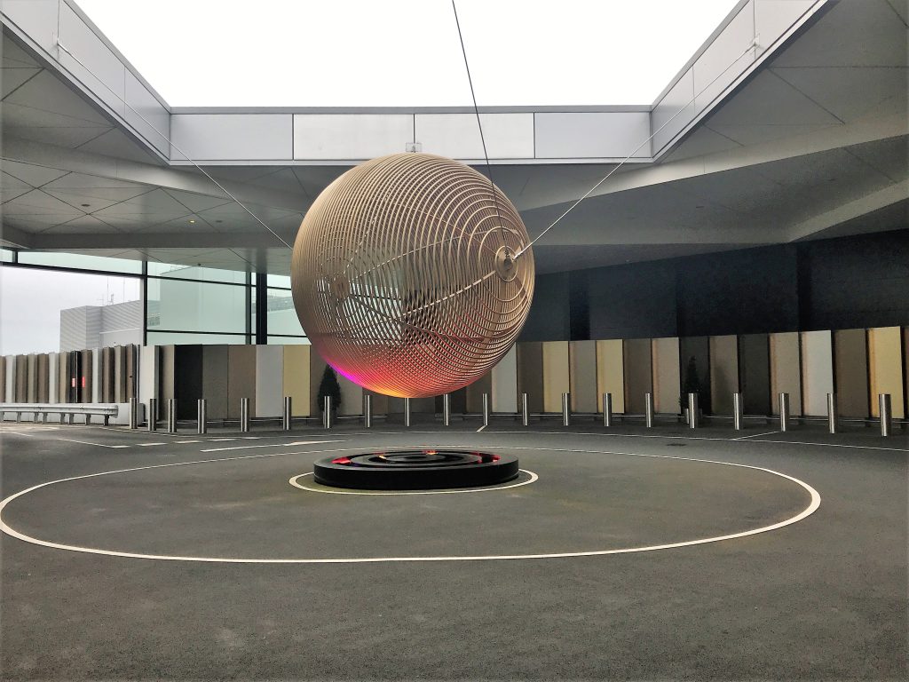
Mexico City International (MEX) – Chronic Overload
Terminal 1 is a never-ending, low-ceilinged hallway. Terminal 2 is a bit better, but the whole place feels like a logistical afterthought.
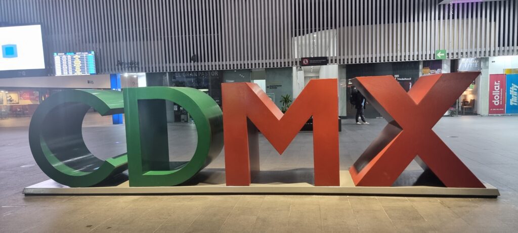
WingTips Verdict: “Not so much form follows function… more like form got lost on the way to the gate.”
Madrid-Barajas (MAD) – Split Personality Terminal Disorder
Terminal 4 is stunning. But the rest of the airport? Dark, dated, and deeply confusing.
WingTips Verdict: “T4 is modern art. The rest? Student housing with gates.”
Washington Dulles (IAD) – Mid-Century Glam Meets Monorail Madness
Eero Saarinen’s iconic exterior hides a frustrating layout and clunky transfers. It is stylish on the outside but baffling within.
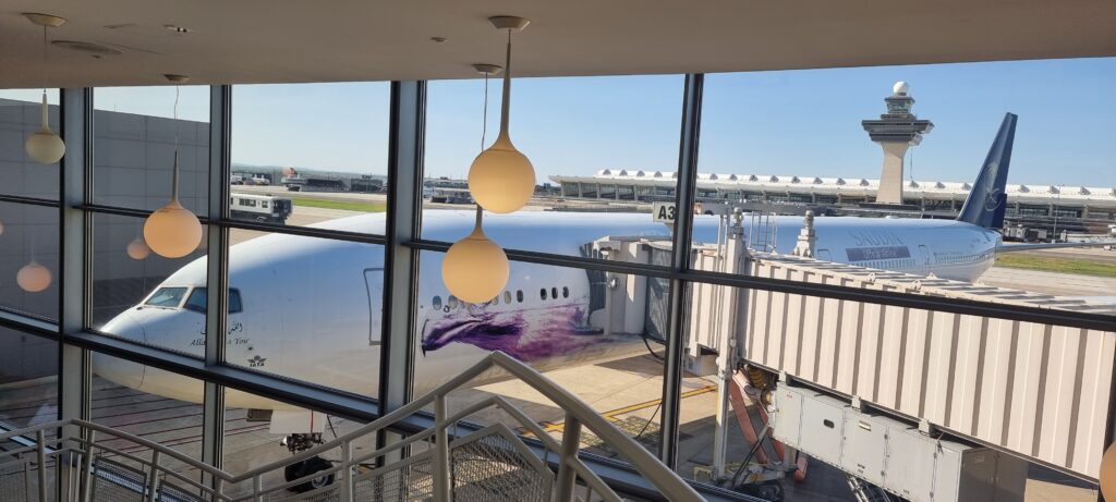
WingTips Verdict: “A stylish shell with logistical nightmares inside. Like putting a Porsche engine in a shopping trolley.”
Taipei Taoyuan (TPE) – Function Over Flair, But Barely
TPE isn’t hideous – just heartbreakingly bland. Efficient, but lacking identity.
WingTips Verdict: “Efficient, but so are spreadsheets – and no one wants to fly through Excel.”
Final Approach: Why Airport Architecture Deserves a Boarding Pass
For most people, airports are just a means to an end – a necessary evil en route to somewhere better. But for me? They’re cathedrals of transit. Monuments to movement. And yes, sometimes, deeply tragic concrete cubes.
As someone who secretly wishes he’d studied architecture instead of airport lounges, I can’t help but notice the way a terminal makes you feel. The lift of a glass roof, the weight of dim corridors, the joy of thoughtful design that actually respects the traveller.
Some airport architecture tell a story. Others whisper, “We had a budget and no imagination.” But the best ones? They give you a sense of place before you’ve even left the runway.
And honestly – in a world of delays, queues, and bad sandwiches – that kind of beauty matters.